
In this article
Introduction
Creating a responsive website is no longer optional—it’s a necessity. With the increasing variety of devices used to access the internet, from desktops to tablets and smartphones, ensuring a seamless user experience across all platforms is crucial. Knowing how to make a web page responsive is a fundamental skill for web developers, designers, and business owners.
In this guide, we will cover the essential principles of responsive web design, tools, techniques, frameworks, and best practices to ensure your website adapts perfectly to all screen sizes.
What Is Responsive Web Design?
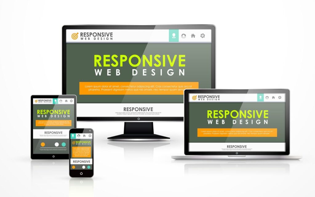
Responsive web design is an approach to building websites that automatically adjust and adapt to various screen sizes, devices, and orientations. This ensures a consistent user experience, regardless of how a website is accessed.
Why Responsive Design Is Important
- Improved User Experience: Enhances accessibility and readability on all devices.
- Better SEO Performance: Google prioritizes mobile-friendly websites in search results.
- Increased Conversion Rates: Mobile users are more likely to convert on responsive sites.
- Cost Efficiency: Reduces the need for separate mobile and desktop versions of a website.
- Future-Proofing: Ensures compatibility with upcoming devices and technologies.
How to Make a Web Page Responsive: Step-by-Step Guide
Step 1: Understand the Basics of Responsive Design
Before diving into the technical aspects, it’s essential to understand the fundamental principles of responsive web design.
Key Principles
- Fluid Grids: Use percentages instead of fixed units for layout elements.
- Flexible Images: Ensure images scale according to screen size.
- Media Queries: Apply different styles based on device characteristics.
- Mobile-First Approach: Design for smaller screens first, then enhance for larger devices.
Step 2: Set the Viewport Meta Tag
The viewport meta tag ensures your web page scales correctly on various devices.
<meta name=”viewport” content=”width=device-width, initial-scale=1.0″>
Step 3: Implement Fluid Grid Layouts
Using a fluid grid layout allows your design to resize proportionally based on the screen size.
Example CSS Code:
body {

    max-width: 1200px;

    margin: auto;

}

.container {

    display: grid;

    grid-template-columns: repeat(auto-fit, minmax(250px, 1fr));

    gap: 20px;

}
Step 4: Use Flexible Images and Media
Make sure images and other media resize properly within their containers.
Example CSS Code:
img {

    max-width: 100%;

    height: auto;

}
Step 5: Utilize Media Queries
Media queries allow you to apply different styles based on screen size, resolution, and orientation.
Example CSS Code:
@media (max-width: 768px) {

    body {

        font-size: 14px;

    }

    .container {

        grid-template-columns: 1fr;

    }

}
Step 6: Apply a Mobile-First Approach
Designing with a mobile-first approach means building your website to work seamlessly on mobile devices before enhancing it for larger screens.
Example CSS Code:
body {

    font-size: 16px;

}
@media (min-width: 768px) {

    body {

        font-size: 18px;

    }

}
Step 7: Test Responsiveness Across Devices
Use various tools to ensure your web page looks and functions well on all devices.
Recommended Tools:
- Google Chrome DevTools: Built-in tool for testing responsiveness.
- Responsive Design Checker: Online tool for checking various screen sizes.
- BrowserStack: Comprehensive tool for cross-browser testing.
Step 8: Optimize for Performance
Responsive design goes beyond layout. It also involves optimizing performance to ensure fast load times on all devices.
Performance Tips:
- Compress images and videos.
- Minify CSS and JavaScript files.
- Enable caching.
Best Practices for Making a Web Page Responsive
- Use Relative Units: Use percentages, em, or rem instead of fixed units like px.
- Prioritize Content: Display essential content first and enhance progressively.
- Test Continuously: Regularly check your website’s responsiveness during the development process.
- Consider Touch Interaction: Ensure clickable elements are large enough for touchscreen devices.
- Keep Navigation Simple: Implement easy-to-use menus for smaller screens.
Popular Frameworks for Responsive Web Design
Frameworks can speed up the process of making your web page responsive.
Recommended Frameworks:
- Bootstrap: Extensive grid system and responsive utilities.
- Foundation: Flexible framework with mobile-first components.
- Tailwind CSS: Utility-first framework for custom designs.
Conclusion
Learning how to make a web page responsive is essential for anyone involved in web design and development. From fluid grids and flexible images to media queries and performance optimization, creating a responsive website requires a strategic approach.
By following the steps outlined in this guide, you can build a web page that looks great and functions flawlessly on all devices. Continue learning and refining your skills to stay ahead in the ever-evolving world of responsive web design.

Md Saizul Amin
Digital Systems Strategist · AI Agent Developer · 9+ years in digital & ITMd Saizul Amin is a digital systems strategist and AI automation engineer from Dhaka, Bangladesh. With 9+ years across IT, web development and digital marketing, he writes practical guides on technology, business, education and online growth — and builds the same kinds of systems (AI agents, websites, SEO and ad campaigns) for clients in Bangladesh, the UK and the USA.
Specialist in
Credentials & experience
- 🎓B.Sc. in Computer Science & EngineeringBangladesh University of Business & Technology (BUBT), 2017–2021
- 🤖AI Automation Engineer · Web Developer · SEO SpecialistUnique Mark Limited, Birmingham UK — 2024 to present
- 🌱IT SpecialistGreen Fund Initiative Inc., USA — 2024 to present
- 🏥Junior IT Consultant — Ministry of Health (DGHS)Built the first national Shareable Health Record website; supported 6,000+ facilities
- 🧭Head of ITWEDO Bangladesh — led IT for 50+ staff, 2021–2023