Creating graphs and charts is a fundamental aspect of data analysis. One of the most effective visualization tools available in Excel is the Scatter Plot. Whether you are working on statistical analysis, financial modeling, or scientific research, a scatter plot helps you visually interpret relationships between two or more variables.
This comprehensive guide will walk you through the steps of How to Make a Scatter Plot in Excel, provide tips for customizing your charts, highlight common mistakes, and showcase advanced techniques to enhance your presentation.
What is a Scatter Plot?
A Scatter Plot, also known as an XY Chart, is a type of graph used to display the relationship between two numerical variables. Each data point is represented by a dot on the chart, with one variable plotted along the X-axis and the other along the Y-axis.
Key Features of Scatter Plots
- Correlation Detection: Identifies positive, negative, or no correlation between variables.
- Pattern Recognition: Visualizes trends, clusters, or outliers in datasets.
- Versatility: Works well with large datasets and multiple data series.
- Statistical Analysis: Ideal for regression analysis and forecasting.
When to Use a Scatter Plot
- Analyzing Relationships: Compare variables to identify relationships or trends.
- Detecting Correlations: Determine if there is a positive, negative, or no correlation.
- Identifying Outliers: Spot unusual data points that deviate from the trend.
- Forecasting: Use trend lines to make predictions based on historical data.
- Comparing Data Sets: Visualize and compare multiple data series in one chart.
How to Make a Scatter Plot in Excel
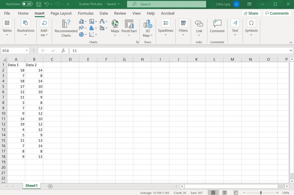
1: Prepare Your Data
- Enter Data: Organize your data in two columns or rows. For example, Column A contains X-axis values, and Column B contains Y-axis values.
- Label Your Data: Ensure your columns have appropriate headers for clarity.
2: Insert Scatter Plot
- Select Data Range: Highlight the data you want to plot.
- Go to Insert Tab: Click on the Insert Tab in the Excel Ribbon.
- Select Scatter Plot: Under the Charts group, click the Scatter Chart icon.
- Choose Scatter Plot Type: Select from various scatter plot types (e.g., simple scatter, scatter with lines, or bubble chart).
3: Customize the Scatter Plot
- Add Chart Title: Click on the chart and enter a descriptive title.
- Label Axes: Add labels to the X-axis and Y-axis for better understanding.
- Adjust Axis Scales: Customize the minimum and maximum values for better visualization.
- Change Marker Styles: Modify the appearance of data points for clarity.
- Add Trendlines: Insert linear or exponential trendlines to identify trends.
4: Format Scatter Plot
- Change Colors: Use different colors to distinguish data series.
- Add Data Labels: Display specific values directly on the plot.
- Gridlines and Backgrounds: Customize gridlines and background for improved readability.
- Legend Customization: Adjust legend placement or remove it if unnecessary.
5: Save and Export
- Save the Chart: Save the Excel file to preserve your scatter plot.
- Export as Image: Right-click on the chart and select Save as Picture to export it as an image file.
Best Practices for Scatter Plots
- Ensure Data Accuracy: Double-check your dataset for errors or inconsistencies.
- Use Appropriate Scale: Select the correct axis scale to avoid misleading results.
- Highlight Key Data Points: Use markers, labels, or colors to emphasize critical points.
- Avoid Overcrowding: Simplify the plot by removing unnecessary elements.
- Add Trendlines for Analysis: Utilize trendlines for regression analysis or forecasting.
Common Mistakes to Avoid
- Using Inconsistent Data Ranges: Ensure all data points are aligned correctly.
- Improper Scaling: Use consistent units and scales for accurate comparison.
- Ignoring Outliers: Acknowledge outliers instead of dismissing them.
- Overcomplicating the Chart: Keep it simple and focused on the key message.
- Mislabeling Axes: Ensure labels accurately reflect the data being presented.
Advanced Techniques for Scatter Plots
- Creating Bubble Charts: Display three variables by adjusting bubble size.
- Adding Error Bars: Show variability or uncertainty in your data.
- Applying Conditional Formatting: Highlight specific data points based on criteria.
- Combining with Other Chart Types: Use scatter plots alongside line or bar charts for comparative analysis.
- Creating Interactive Scatter Plots: Utilize tools like Excel VBA or Power BI for dynamic charts.
Conclusion
Knowing How to Make a Scatter Plot in Excel can transform your data analysis process, making it easier to uncover patterns, trends, and relationships. By following the steps outlined above and implementing best practices, you can create compelling scatter plots that effectively communicate your findings.
Whether you’re a student, professional, or researcher, mastering scatter plots in Excel is an invaluable skill that will enhance your analytical capabilities.